All Things are Not Created Equal
Karen Menezes on August 9, 2013The Equal Height Problem never ends! It gets even worse with adaptive layouts with rows of equal height blocks.
After witnessing and attempting the mind-boggling solutions (a.k.a. beautiful CSS hacks) in the wild, I was convinced that Javascript was the saviour. I had a little snippet of jQuery code that I would add to projects to set the height of the tallest column to the others.
Now that Flexbox is here, the equal height issue via CSS has been resolved once and for all, but I’ll wait some more until we can ‘Flex’ our muscles to tackle real world projects.
Early this year, I decided to use the CSS table layout model for a project. In this particular case, it failed.
March 2013
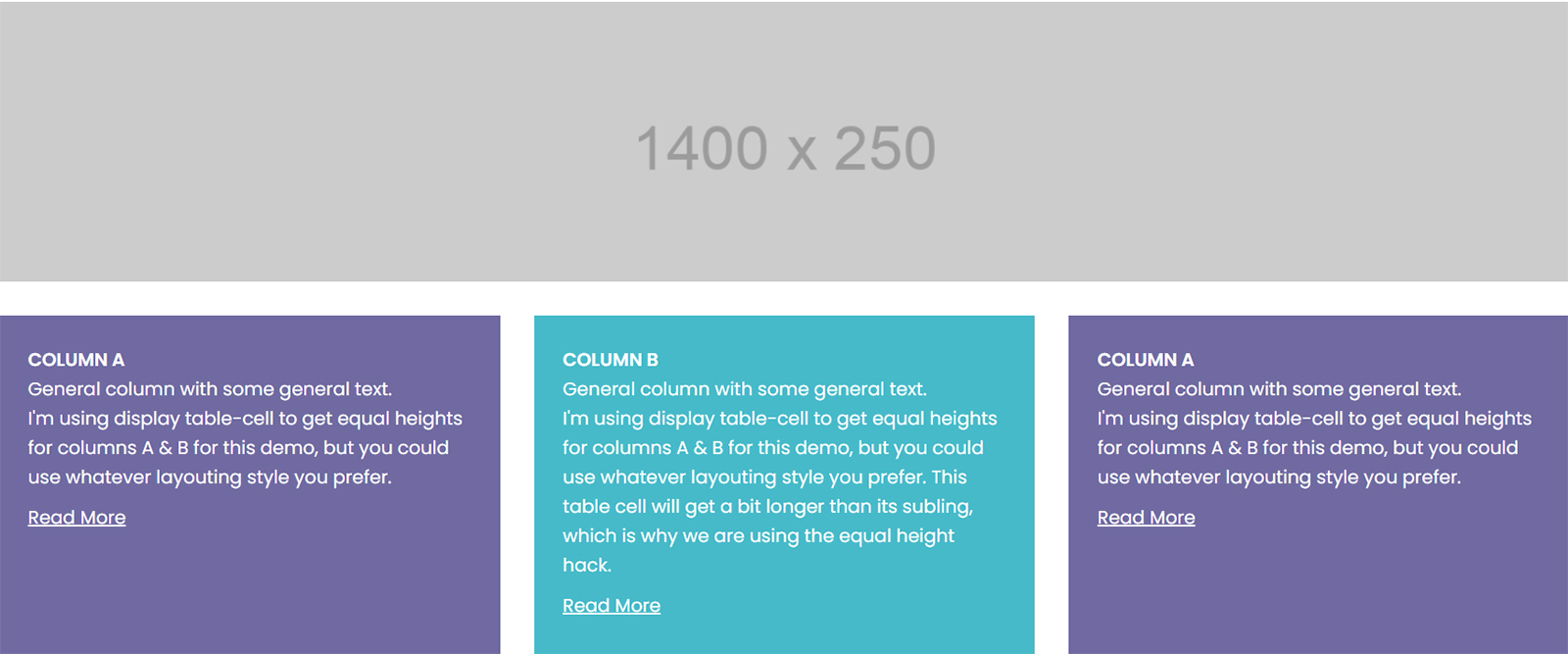
The graphic designer sent a PSD for the home page with an image, followed by three boxes of text, each with a ‘read more’ link. The text was of varying lengths and the site was a responsive one. I decided to use display: table to go the pure CSS way. Each table ‘cell’ had a width of 33.33% and a 1 pixel border. I’ve recreated my efforts below, minus any cool styling.
Not bad… However, margins are still pending. But table-cells or CSS tables can’t have margins! So we rely on the border-spacing and border-collapse properties to add spacing between cells, which must be declared on the element with display: table. (Note: Browsers, by default, generally apply border-collapse: separate to keep spacing between cells. However, I still declare it in the stylesheet.)
I also gave a border-spacing of 30px. Do note that border-spacing can accept 2 values, in which case the first handles horizontal and the second vertical spacing.
So we’re close, except that we need to remove the left ‘margin’ from the first column and the right ‘margin’ from the last. How in the world can you do this (considering it's border spacing on the element with display: table)? After some horrible attempts, I abandoned the pure CSS solution and went ahead with JS for that project.
August 2013
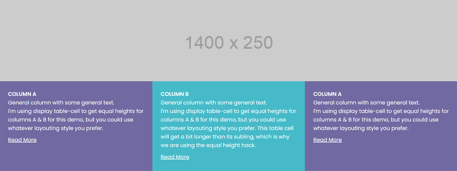
A few months later, I re-visited the situation with renewed zeal. By now, I had expanded my vision for the demo to include not just one, but several rows of equal height boxes. And then, it occurred to me. Simply declare negative margins on the table!
Since border-spacing is 30px, I declare negative left and right margins of 30px to snap the table back to the grid. Voila! It works beautifully. I was ready to blog about this and then looked at the window, only to see a beautiful horizontal browser scrollbar. I checked the stylesheet, experimented way too much, only to realise that the problem was that the width of the combined negative margins was the offender.
Note: This is a problem that could happen if your border-spacing is quite large but otherwise, may not even show up. If so, you don't need to apply the fix below.
There are a couple of fixes for this:
1) Apply overflow-x: hidden to the body. Should be fine in many cases, but personally I’d avoid it. Lord knows when it might get in the way.
2) Wrap the element with display: table in a div that has overflow hidden set on it. I’d go with this one. So I’ve wrapped the .tableBlock div in a .tableWrap div.
And there you have it. A pretty neat solution for equal height columns, without a single line of JS!
On the respective media query (whether in px/em), convert everything to display: block, reset the negative margins, and you’re good to go!
Note: This is a barebones demo, so it’s purposely stripped off unnecessary styling code. There’s not even a reset or normalize.css. The only code I’ve used is box-sizing: border-box (universally) and max-width: 100%, height: auto (for images), to make the demo page responsive.
Demo of equal height columns in rows here
Pros
- Display table and table-cell naturally allow elements in a row to have equal heights.
- Vertical centering of the content in the table cell can be easily achieved by manipulating the vertical-align property.
- Works well for a responsive layout that’s moving from about 3 or 2 columns down to 1.
Cons
- The major issue with this setup is that one can’t easily go from 3 columns to 2 columns and then down to one in different media queries. It works best when you need to go from ‘x’ number of columns directly to 1 on a narrower screen. I would personally restrict the number of columns to a maximum of 3.
- Doesn’t support IE6 and IE7. Yawn…
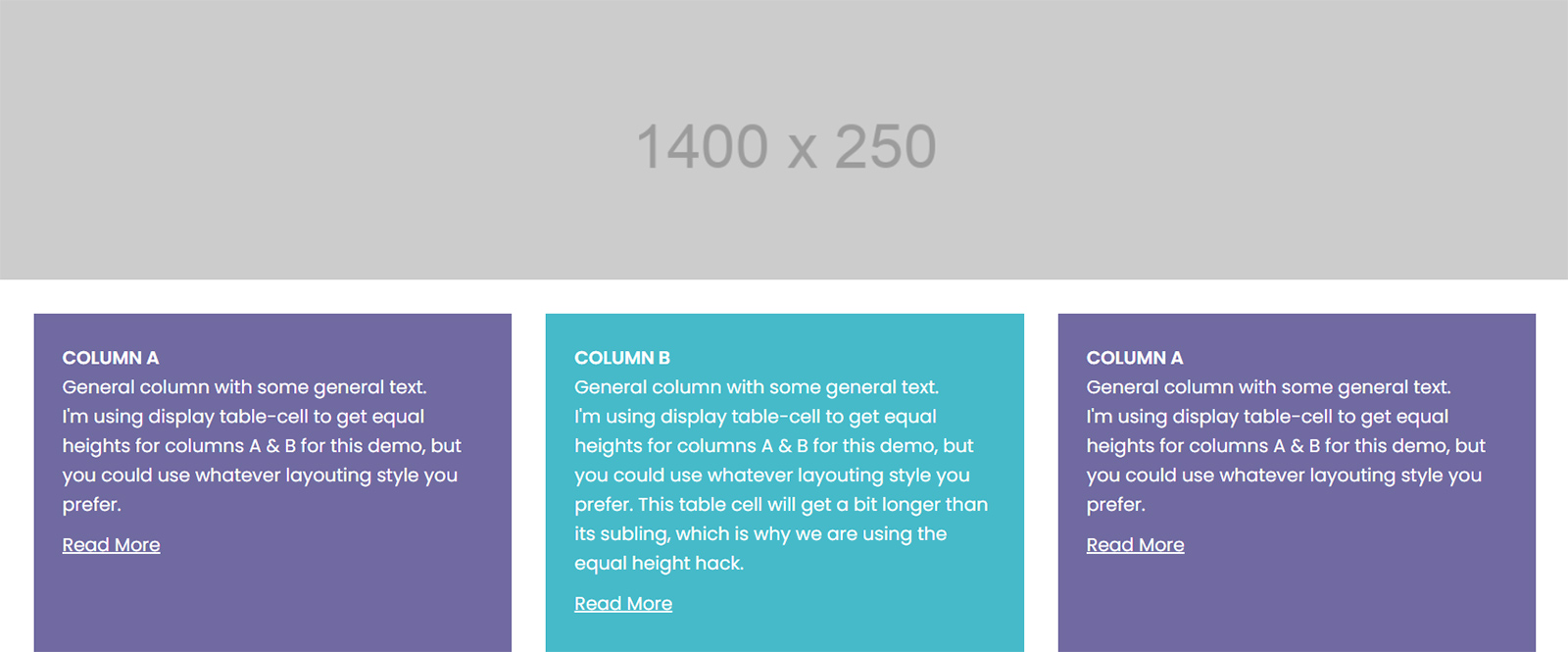
- If you’re looking for equal widths coupled with equal heights, you may run into this problem, if one of the table cells has a ridiculously long word or link. It’s important that you’re aware of this, for it has implications for your layout on different-sized screens, especially if you're using the overflow hidden fix. See the screenshot below.