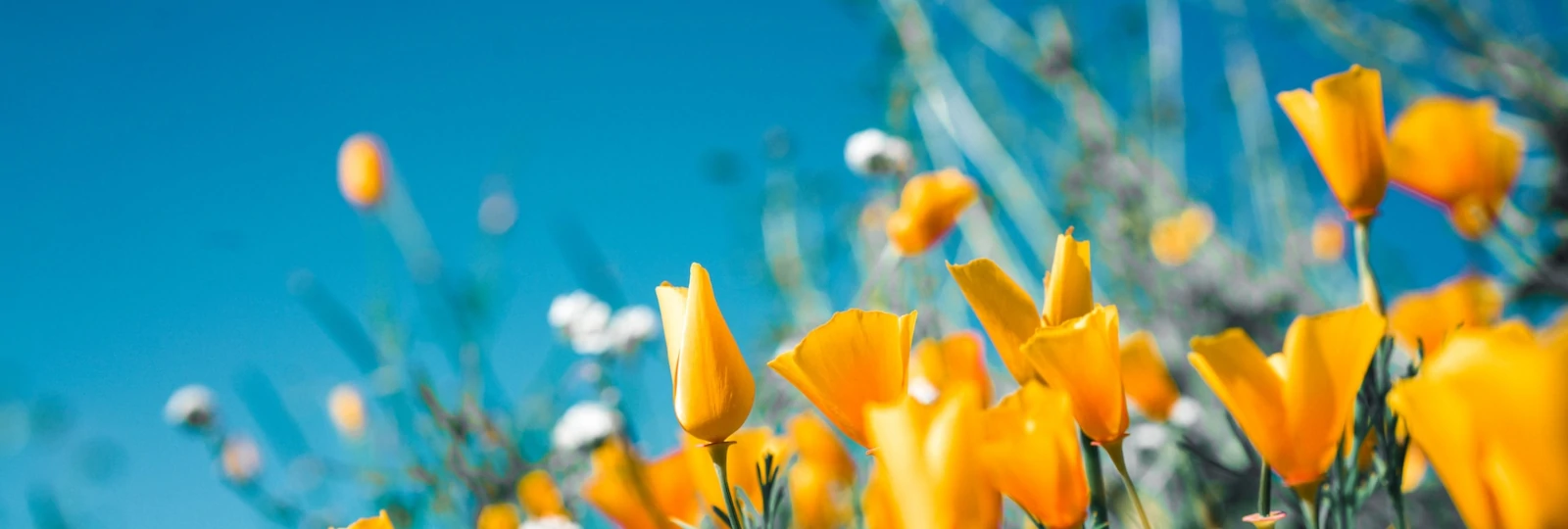
An Introduction to CSS Filters
Karen Menezes on November 24, 2012There’s nothing that gives me more pleasure than skipping the Photoshop/GIMP image editing layer while coding a site.
With CSS filters, you can manipulate images within your stylesheet, which makes for interesting possibilities, especially while using transitions or animations. You can blur images, convert them to black-n-white, boost saturation or brightness and more, with just a line of CSS (excluding vendor prefixes, of course).
At the time of writing this article, filters for CSS are still at an early stage of development and it’s possible that the spec could be modified or parts of it even deprecated. Just so you know, support for filters for SVG objects has existed since a while now.
Once you take a look at all this, it’s not hard to believe that Adobe had a significant role to play - infact, they had proposed CSS Shaders, that has now been integrated into the CSS Filters Effect Specification.
You can start using the filters for simple progressive enhancements (like changing properties on hover).
The general syntax is:
selector {
    filter: type(value);
} /* for a single filter */

selector {
    filter: type(value) type(value) type(value);
} /* for multiple filters */
In terms of performance, CSS filters are definitely GPU accelerated on Chrome and should be on mobile browsers, I presume. Now that's a plus point :)
The most expensive filters are blur and drop shadow, since it takes a bit longer to generate them.
Conclusion? It’s fairly safe to use them in moderation on your site.
From what I’ve seen, CSS filters can be applied to any element in the DOM and not just images.
The following filters are currently available.
Note: In the table below, I've not added any vendor prefixes below the image. You will need to add a webkit prefix for it to work in the browsers that support it, as of now. If you wish to future proof your code, please add the other vendor prefixes (o, ms, moz, and of course, webkit) above the standards property.
| TYPE | VALUE | RANGE | USAGE |
| - | - | - |  Default image without filters applied to it. |
| grayscale | % / integer / decimals | 0% - 100% or 0 - 1 0 is unchanged, 1 / 100% is the highest value |
filter: grayscale(100%); |
| sepia | % / integer / decimals | 0% - 100% or 0 - 1 0 is unchanged, 1 / 100% is the highest value |
filter: sepia(100%); |
| saturate | % / integer / decimals | 0% onwards / 0 onwards 0 is unchanged, 1 / 100% appears unchanged, but is 100% saturation. Values over 1 / 100% are even more saturated. |
filter: saturate(200%); |
| hue-rotate | degree | 0deg - 360deg 0 is unchanged and as the angle increases, it shifts hue along the colour wheel or spectrum back to its default at 360 degrees. Note: You can specify degrees greater than 360, but they will be treated in the following manner, i.e. 370 degrees will treated as 10 degrees. |
filter: (hue-rotate(200deg); |
| invert | % / integer / decimals | 0% - 100% or 0 - 1 0 is unchanged, 1 / 100% is the highest value. 0.5 or 50% always renders the element grey. |
filter: invert(100%); |
| opacity | % / integer / decimals | 0% - 100% or 0 - 1 0 is full transparency and 1 / 100% is unchanged. Works the same as the property 'opacity', as far as I know. |
filter: opacity(40%); |
| brightness | % / integer / decimals | 0% - 100% or 0 - 1 In Chrome, 0 is unchanged and 1 / 100% is full brightness or white. This seems to be a bug, since the spec says that 0 makes the image black, and it appears unchanged at 100% and brightness progressively increases from there. I've filed a bug here. Update: The issue was fixed for 27.0.1412.2 (Official Build 182503) Chrome Canary in Feb 2013. This demo image now works in line with the spec, on Chrome. |
filter: brightness(60%); |
| contrast | % / integer / decimals | 0 onwards 0 is lowest contrast, 1 / 100% appears unchanged, but is 100% contrast. Values over 1 / 100% have higher contrast. |
filter: contrast(200%); |
| blur | Length (e.g. px, em, etc.) | 0 onwards 0 is unchanged |
filter: blur(2px); |
| drop-shadow | Length (Horizontal Offset), Length (Vertical Offset), Length (Blur radius), Colour | Length (positive or negative values for horizontal and vertical offsets), Colour (alpha transparency via rgba) Blur radius is an optional value | filter: drop-shadow(2px 4px 6px #800080); |