Embossing that Code
Karen Menezes on September 5, 2012Here's a simple CSS solution to create those lovely embossed effects on lines and text in your content. Unwanted images hurt my vulnerable CSS soul.
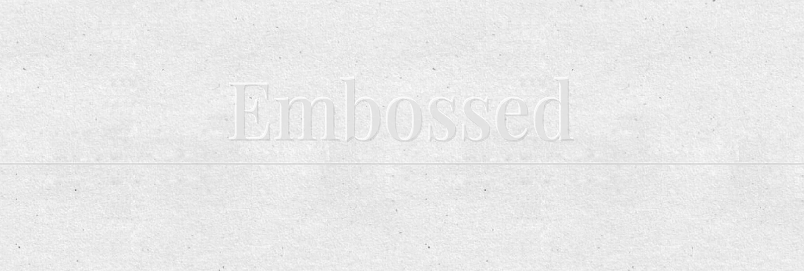
I've cooked up a quick demo on a subtle grey background image.
Text Embossing:
Note: The embossed effect on the text works on all IE10+ and all other browsers. IE9 and below don't support the text-shadow property.
I've used a combination of two text-shadows and set the text color to slightly darker than the background, both via rgba. You can also set the color to transparent; it looks quite cool (but then IE9 and below will see nothing, since the two text-shadows provide the outline).
What's crazy is that if you provide a dark, legible fallback color, IE8 will see it (minus the text-shadow, of course). IE9, on the other hand, will take the very light or transparent text colour (since it reads rgba values), but not the text-shadow, which makes it very hard to read.
Conclusion: You'll need to get a polyfill for IE9 to deal with this use-case, when you need the embossed look on a background of largely the same colour.
Line Border Embossing:
Note: The embossed effect on the line works on all browsers and IE8+.
This is super simple. All I did was create a bottom border with a semi-transparent border, and used content::after to add a semi-opaque white div just a little over it to create an illusion.
Code for text and line below:
#wrapper h1 {
font-size: 700%;
text-transform: lowercase;
font-variant: small-caps;
text-shadow: 1px 1px 0px rgba(0, 0, 0, 0.1), -1px -1px 0px rgba(255, 255, 255, 0.5);
color: #aaa;
 color: rgba(190, 190, 190, 0.1);
 line-height: 1;
 border-bottom: 3px solid #ccc; /* fallback for old IE */
 border-bottom: 3px solid rgba(0, 0, 0, 0.2);
 display: inline-block;
 position: relative;
}

#wrapper h1:after {
 content: "";
 position: absolute;
 bottom: -2px;
 left: 0;
 height: 3px;
 background: #ddd; /* fallback for old IE */
 background: rgba(255, 255, 255, 0.5);
 width: 100%;
}