St Giovanni, Ranui. The Dolomites, Italy
October 1, 2025
St Giovanni (Chiesa di San Giovanni) is a beautiful, small church with hand-painted frescoes of the patron saint, St John, and an onion dome the colour of charcoal. It is framed by endless green meadows, forests and the massive, pointed peaks of the Odle mountain group.

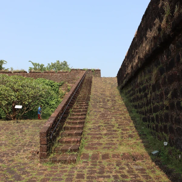
Reis Magos Fort, Goa
May 13, 2025
Kasanas from Reading Blurbs reviews Safe Passage
September 25, 2024
The first chapter sets the tone for the rest of the book. There’s something fantastical, yet technical about how Menezes describes the tower and the curved room, and it shows in the characters and the world Menezes creates.

Author Interview by Laura Smith for The Chronicles of Capherayna
September 22, 2024
Laura Smith from Laura's Books and Blogs has done a lovely author interview for The Chronicles of Capherayna series. You'll learn about my thoughts on typewriters and whether I'd rather own a library or run a bookstore.
.jpg)
Kathy L. Brown's review of Safe Passage
September 14, 2024
Safe Passage explores the interaction of people and the natural environment and really shines when it describes the myriads of plant and animal life in the deep forest.

Review of Safe Passage: Making Good Stories
September 1, 2024
Opening with lyrical contemplative reflections before shifting into the narrative, a captivating story unfolds containing elements of magical realism with the unique abilities the illusionists practice and the unique, mystical nature of the forest.

Book Covers of The Chronicles of Capherayna series
August 31, 2024
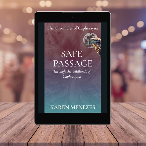
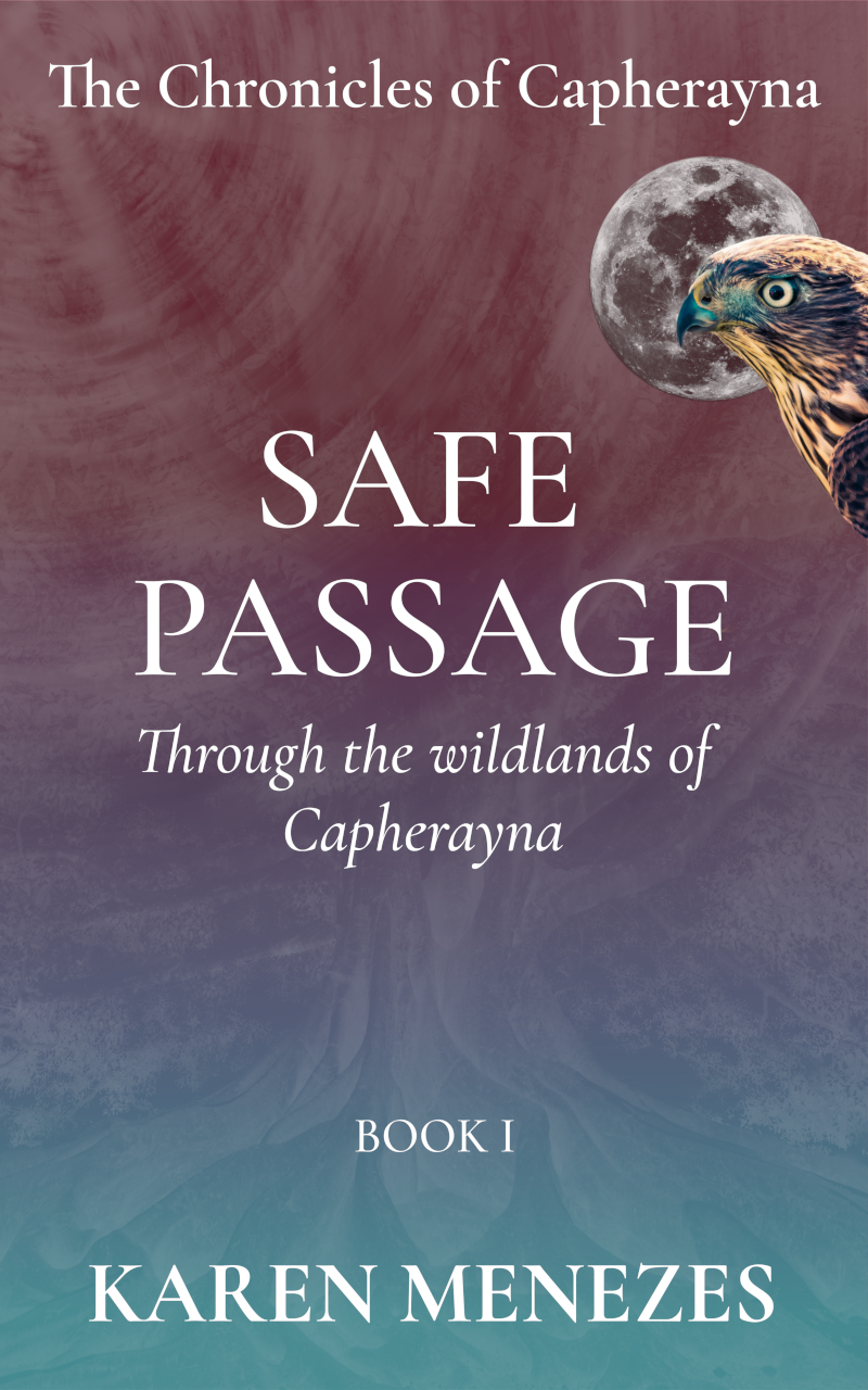
Every book cover in the series has two elements in common: a full moon and a creature that features in the book. The colour palette changes with each book, matching the mood and tone of the story.
Review of Safe Passage: Book Reviews for Bookish People
August 28, 2024
What I loved about Safe Passage was the mixture of grounded social issues and fantastical sci-fi/fantasy elements that are used to build the narrative Review by Emily from 'Book Reviews for Bookish People'

The Protagonist Speaks
August 9, 2024
Here's a fun interview with the Lightbender, the protagonist of The Chronicles of Capherayna. He discusses his childhood in the mountains, gives us the scoop on his latest adventures and tells us a secret that no one else knows.

The Chronicles of Capherayna
July 2, 2024
The newly launched series blurs the line between reality and fantasy, past and present, good and evil. It traces the Lightbender’s journey over terrain and time, as he soaks up the immense pain of humanity. As a healer of the alternative arts, he has perfected the nomadic life but is petrified of intimacy and the settled life.
Kiyomi Talaulicar
September 5, 2022
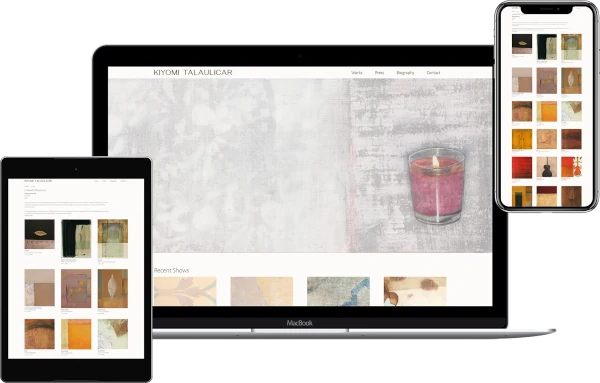
Almost four decades of work have been condensed and archived online in Kiyomi Talaulicar's site. Her body of art is layered, evocative and rich in silence. Paradoxically, it transcends the mundane through the use of mundane objects against textured backdrops of pattern and shadow.
Under1Tree
August 18, 2022
Under1Tree's website takes the user on a journey of beautiful animations that represent a green lifestyle and sustainable living.

The Center for Cultural Power
August 8, 2020
The Center for Cultural Power redesigned their website in 2019, achieving a vibrant, high-contrast look. Bold imagery, gradient blocks of colour, eyecatching artwork and authentic stories provide a compelling narrative of social change through culture.

Inchin Closer Mobile App
June 20, 2020
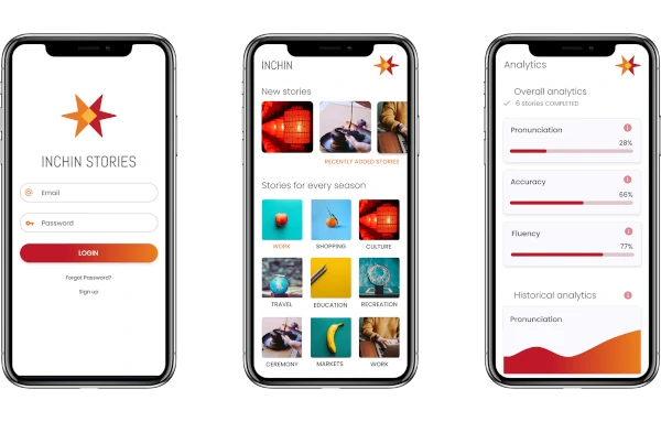
Inchin Closer's app provides a series of interactive stories, audio-based hints and analytics of progress to help users master the word's hardest language - Mandarin.
Space Archive
June 10, 2020
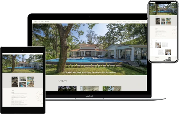
Line drawings, minimalism and elegance define the Space Archive website, mirroring the nature of the business - curating high-end properties and villas in Goa and the Himalayas.
Pluralsight Course: Creating a Living Style Guide with Sass and Vanilla JavaScript
January 7, 2020
I've published a new course on Pluralsight titled Creating a Living Style Guide with Sass and Vanilla JavaScript. Using a real-world example, the course will guide you on thinking modularly about design and development by creating globals and components that are flexible and extensible.
Replicating Preprocessor Color Functions with Plain Old CSS
July 17, 2019
I was ruminating on Sass’ lighten and darken functions today morning and wondered whether there was a way to do this via native CSS. I also remembered that I haven’t ever used HSL to define colors in my stylesheets and wondered whether this was the solution.

Favianna Rodriguez
February 23, 2019
With an accent colour of watermelon pink and triangle motifs across the site, Favianna.com is a juicy rainbow of colour that spans themes ranging from social justice to ecology. The site retains a minimal look to highlight her work across decades of diverse disciplines.

Diligent Financial Planning
September 26, 2018
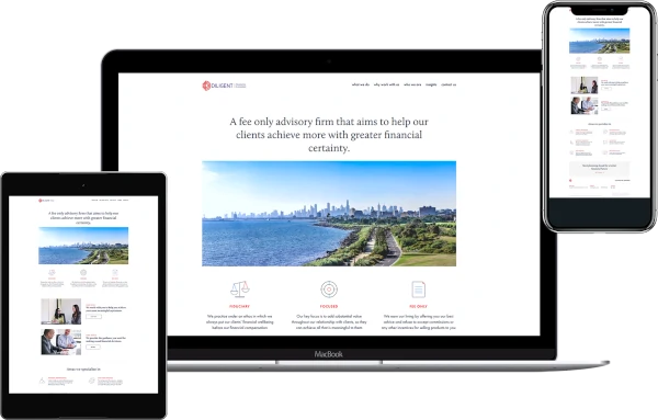
Diligent Financial Planning overhauled their Wordpress site and rebranded it with a clean look, curated content and elegant animations on scroll.
Front-end Setup with Ubuntu 18
May 12, 2018
A hard disk failure forced me to undertake the painful task of re-installing all my projects and underlying softwares on Ubuntu 18.04. I've documented a basic list of packages that a front-end designer or developer requires to be productive nowadays.

MHI
April 4, 2018
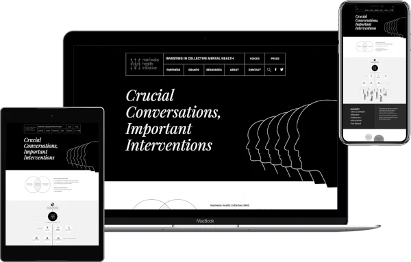
In 2018, the MHI site was transformed into a crisp, accessible black-and-white interface using illustrations and infographics to condense the organisation's mission and purpose.
Up&Go
February 2, 2018
The Up & Go website reflects the values of its brand - clean living, a worker-owned cooperative and fair work practices.

Text Inputs with Icon and Decorative Line
August 1, 2016
The Input Icon component is greatly simplified by using background images. In this case, multiple background images, including an SVG and a linear gradient, have been used to achieve the left border on the icon.
Variables: The Backbone Of CSS Architecture
January 16, 2016
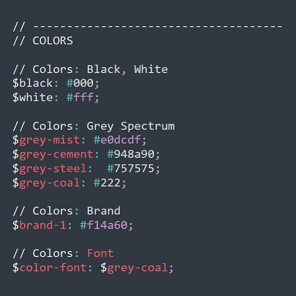
When I'm handed an existing project, the first thing I look at is the variables file for CSS. Well-defined variables set a great foundation for a project of any size.
Published in Smashing Magazine, Jan, 2016.
Pluralsight Course: Responsive Web Design in the Browser
January 16, 2016
My course on Pluralsight focuses on Responsive Web Design in the browser. It's meant for those who wish to bypass the Photoshop/Sketch layer and get some CSS chops without relying on frameworks like Bootstrap and Foundation.
