Creating Responsive Shapes With Clip-Path And Breaking Out Of The Box
July 20, 2015
CSS' clip-path property is your ticket to shape-shifting the monotonous, boxy layouts traditionally associated with flat, responsive design. Once you get your hands dirty with clip-path, there’s no end to the shapes you can generate, simply by tweaking a few values.
Published in Smashing Magazine, May 2015.

Karnataka Learning Partnership
July 4, 2015
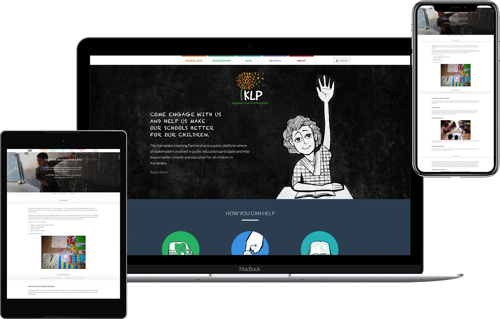
The KLP website had become a nightmare to maintain. A living style guide and rewrite of the existing CSS framework fixed the underlying issues.
Styling SVGs inside Image Tags
March 24, 2015
You know the trade-off. Use the img tag to display an SVG, and you get clean markup but at the cost of styling the SVG.

Harnessing Flexbox for Today’s Web Apps
March 6, 2015
I’m using flexbox in a big way for a web app that I’m currently working on, and I am very pleased with how it handles layout and box calculations intelligently. Small modules work very well with flexbox, and you can use floats and other tools for broader sections of the layout.
Published in Smashing Magazine, March 2015.

IE Bug: Keyframe Animations Inside a Media Query Block
December 26, 2014
If you ask me, the worst kind of bugs are for modules or properties that a browser claims to support, but not entirely so. IE has supported CSS keyframe animations since IE 10. However, I recently discovered a bug in the latest version.

CoLab
December 18, 2014
The CoLab redesign has immersive, fullscreen backgrounds, lucid content and subtle animations, including smooth image pixelations on scroll.

Another Pure CSS Checkbox Article
November 1, 2014
So here we go again. Three demos of pure CSS checkboxes and radio buttons. I generally keep my demos raster free and bereft of extra styling. The reason is so you can add your own styles and not have to override the demo styles.

Your Font has Too Many Faces and Woff Not
October 13, 2014
Woff was specifically created for using custom fonts via the @font-face rule. Every single modern browser has adopted it. So why not skip the other formats and use it exclusively?

The Flyover and the Farm
October 11, 2014
Once you reach the summit of the aged Mohamedi Manzil building, you spend a few moments trying to make sense of this big, fat terrace farm in the middle of this big, fat street.

Slanted Buttons with 3 Lines of CSS
June 18, 2014
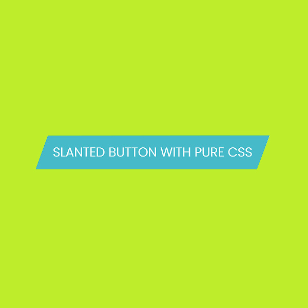
Two weeks ago, a designer sent in an app landing-page mockup with slanted buttons. I attempted to do this the most natural way, i.e. using CSS transforms via skew. I skewed the button selector and it worked beautifully, except that it skewed the text as well.
Floats, Inline Block or Display Table? Or Flexbox?
April 13, 2014
Most grids and front-end frameworks insist on floats for layouting. You're occasionally better off with inline-block, rarely display-table, and if your browser support is ideal, flexbox. This article discusses the advantages and disadvantages of various layouting methods.

Ryan Fait's Sticky Footer (but Responsive)
January 14, 2014
A few days ago, an eureka moment occurred: why not take Ryan Fait’s solution (which is quite elegant, by the way), and add a teeny weeny bit of JS, to get a footer that works for a responsive layout?

Why is Calc At-risk?
December 10, 2013
Calc makes CSS very, very pretty. It does the heavy lifting for you. You can mix percentages with pixels or ems, and add, subtract, multiply and divide. So why is calc an at-risk feature? Let's take a look at some real-world use cases for calc.

Equal Heights with Flexbox
October 15, 2013
I’ve been playing with flexbox for a while. I love it. It’s going to save so many kittens. This is going to be the first of a series of demos of what flexbox is capable of.

The Inline-Block Conundrum – Part 2
August 30, 2013
This articles covers 3 use cases where inline-block layouting forms a good solution. Fluid image grids, horizontally centered menus and borders on elements are discussed.

All Things are Not Created Equal
August 9, 2013
The Equal Height Problem never ends! It gets even worse with responsive layouts. After witnessing and attempting the mindboggling solutions out there, I was convinced that JavaScript was the saviour... until I revisited the situation recently. Here's a pure CSS solution.

Beautiful Icon Font Thumbnails
June 23, 2013
When a client calls up and asks to increase the icon size by 20% or tweak colour values and shadows, it’s a breeze to make changes in the stylesheet directly. I've made a demo with 16 different ways you can creatively use font icons in your next project.
The Inline-Block Conundrum – Part 1
June 16, 2013
It’s somewhere in-between inline and block. And it’s often precisely what you need. When nothing else can cut it, display: inline-block does the job. Of course, it doesn’t come without its share of quirks. Let’s tackle the eccentricities a little down the road…

Linebreaks via CSS Generated Content
June 10, 2013
This is about a situation where you need to insert a linebreak between successive inline elements. A bit of white-space manipulation and generated content saves the day via pure CSS.

Pure CSS Icons for App Views
May 1, 2013
Multiple views are a useful UI feature to allow users to choose how they wish to browse content on a web application. The most common views are thumbnail, detail and list views. The icons for the same are pretty straightforward. Of course, in the spirit of resolution independence, I was dead against using raster graphics, so PNG and JPG file formats went out of the window.
The Story of a Walk
January 31, 2013
At low tide, the rocks create little tide pools in the ocean, as pretty as the wading pools in the grass today. As you've probably figured, the sitout's a great place for scenic-scapes - tide pools in front of you, wading pools behind! flocks of gulls perch at the line of water unruffled. To their right is the Afghan church, its steeple like a spinal cord arching for the sun. There's plenty of pink in the background, most likely fall colours of the Indian almond tree.

City Farming Gurus in Mumbai
January 28, 2013
City farming can greatly reduce the burden of kitchen waste through compost. Greater Mumbai generates about 6000 tonnes of garbage per day, of which only 3-4% is composted. As our landfills choke with filth, one wonders, “Why not compost biodegradable garbage at a local level, rather than burdening the civic system?”

Dropping Support for Vendor Prefixes
January 14, 2013
If you’re using CSS3 properties for graceful degradation, it’s probably fine to drop vendor-prefix support for certain properties. It’s best to educate clients about future maintenance woes and why it’s absolutely fine if Firefox 3.6 users will see square corners and no shadows, as long as you’re not breaking the site's layout.

Code Resolutions for the New Year
January 1, 2013
Clean up your CSS at the source. Write appropriate classes and group selectors well. Let go of unnecessary vendor prefixes for certain properties. It's ok to use IDs when they're needed for the sweet specificity they proffer. Utilise the power of CSS selectors like nth-of-type, nth-child, siblings and attribute selectors.
Be Kind to Front-end Web Developers Day
December 22, 2012
Yesterday, the world did not end. So, today is "Be kind to front-end web developers day". Today, we pretend that Bugs, Internet Explorer 8 and below, Retina Devices and low bandwidth DO NOT EXIST. We pretend that older browsers look like shit on your Web 3.0 site.
