Box-shadow v/s Drop-shadow
Karen Menezes on November 26, 2012There's a new wave of CSS madness, ushered in by the recent additions to the W3 Filters Specification. Although this is all very recent and in flux, there's no need to hold back or experiment with design enhancements. For more details on CSS filters, read my article here or do an online search, if you're unacquainted with the topic.
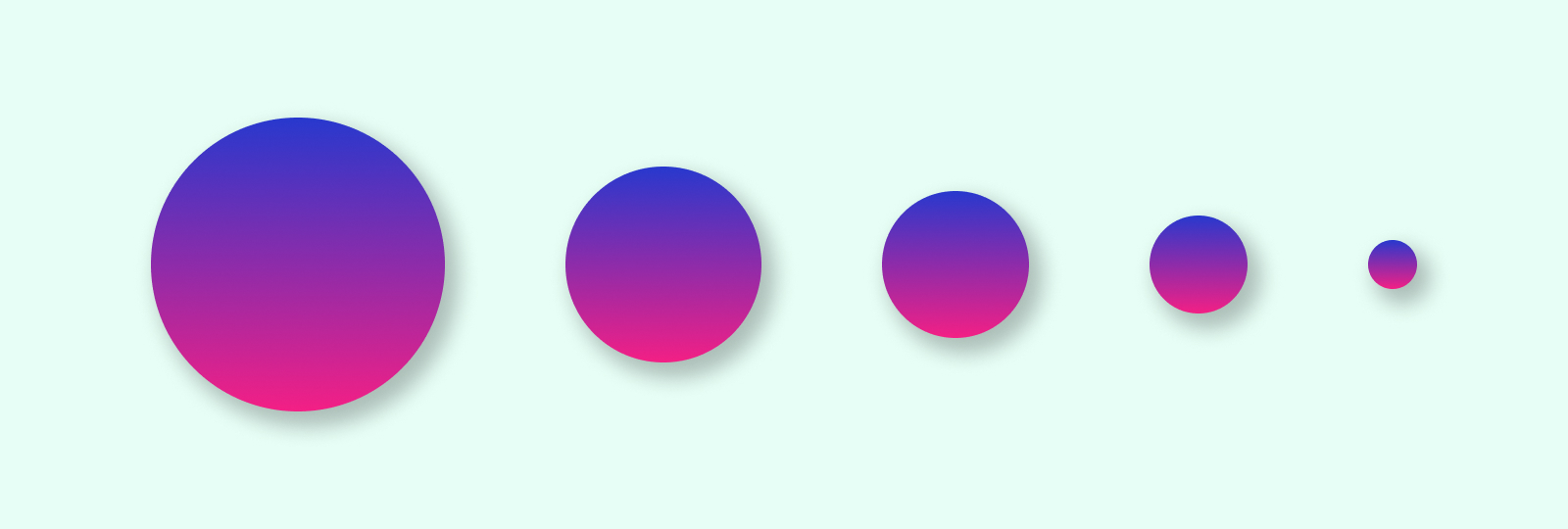
An important issue that keeps coming up is the new drop-shadow filter and whether it serves a purpose. We already have the wonderful box-shadow property, that allows one to create custom shadows by specifying a horizontal offset, vertical offset, optional inset keyword, optional blur radius and optional spread radius.
Is there a difference between the two?
Note: Check the demos below on an updated version of a webkit browser like Safari or Chrome, since CSS filters, with this syntax, are currently supported only on Webkit browsers.
1) GPU acceleration
In most browsers, CSS filters are and will be GPU accelerated. So a very slight performance advantage there for drop-shadow.
Winner: drop-shadow
2) Shadows for transparent backgrounds
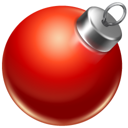
More importantly, drop-shadow will apply a shadow to a PNG image around the edges of the image and not the rectangle boundary, like box-shadow does.
Winner: drop-shadow
box-shadow: 2px 2px 6px rgba(0,0,0,0.5);
-webkit-filter: drop-shadow(2px 2px 6px rgba(0,0,0,0.5));
filter: drop-shadow(2px 2px 6px rgba(0,0,0,0.5));
3) Generated Content
For those who use generated content (:before or :after) to create cute speech bubbles and ribbons and what not, drop-shadow respects the edges, just like it does with PNGs.
Winner: drop-shadow
Example of box-shadow on a div with generated content. Note the lack of shadow around the triangle.
box-shadow: 2px 2px 6px rgba(0,0,0,0.5);
Example of drop-shadow on a div with generated content. Check out how the shadow intelligently wraps the edge of the triangle.
-webkit-filter: drop-shadow(2px 2px 6px rgba(0,0,0,0.5));
filter: drop-shadow(2px 2px 6px rgba(0,0,0,0.5));
4) Inset Shadows and Spread Radius:
Drop-shadow does not, however, generate inset shadows or accept a spread radius value. Whenever you need these options, box-shadow is the obvious choice. It remains to be seen whether this will change in later drafts of the spec. Currently the spec mentions that the inset keyword is not permitted while using drop-shadow.
Winner: box-shadow
5) Browser Support
In terms of current browser support, box-shadow is what you need to be using. CSS filters are in an early stage and only work with the -webkit prefix in the browsers that support it, as of now.
Winner: box-shadow
Note: You will see no tangible difference between box-shadow or drop-shadow on a jpg image or DOM element, if you are just using the horizontal offset, vertical offset and blur radius.
In general, I will continue to use box-shadow for a while, except when shadows are required on PNG images or generated content.
Credits
Thumbnail and Banner Image by Karen Menezes
Red Ball Image by FreeImages